Saturday, October 29, 2011

Paint The House - Part II

We did it! We finally made a decision - after a bit more deliberation in store. We came home with 7 cans of paint, rollers, paint trays, etc. and about $500 lighter in the pocket (eesh!).

But I'm super excited because we did end up getting Taos Taupe (for the living room) and Silver Fox for the hall/stairs/landing. We were originally going for a gray or taupe for the bedroom but I had the idea of going for a violet-gray. Cam wasn't a fan so I suggested a light blue instead - something smokey and calming, instead of cute and cheery.

We ended up going with Smoke. The name is a little misleading. Yes, it is gray but more like a calm sky covered by gentle clouds than cloying smoke. I found some examples of each paint color used in a room. You'll notice it can look quite different depending on the lighting.

BENJAMIN MOORE SMOKE

image via styleathome.com

image via decorpad.com

BENJAMIN MOORE SILVER FOX

image via decorpad.com

image via decorpad.com

BENJAMIN MOORE TAOS TAUPE

image via decorpad.com

Can't wait to paint the walls so we can finally unpack and I can start decorating!

Friday, October 28, 2011

Paint This House

It's now been a week since we moved into our new house and low and behold, there are still plenty of boxes to be unpacked. In fact, there are more packed than unpacked.

We've gotten comfortable and settled in now, which is great but at the same time, not so great. I really don't want our decor to be stacks of boxes! So this weekend, I'm hoping to visit the paint store and bite that bullet. Instead of pondering over 5 different versions of "warm taupe", I'm just going to buy one...because paint = pretty walls = unpacked boxes = PROGRESS.

Makes sense, no?

My research has consisted of scouring Decorpad.com, decor magazines, and carrying around paint strips I've picked up from Home Depot, Rona, Lowe's, etc. Based on the reviews I've read online, I plan to go with Benjamin Moore paints, specifically their mid-range Regal collection.

Paints at the local hardware store are around $25-40 and what I've always used. I believe the last ones I used were Premier from Canadian Tire and Behr from Home Depot. They weren't bad but I'm curious to try out BM, which is considerable more (considering how many gallons we'll need!).

BENJAMIN MOORE INTERIOR PAINT LINES & $CDN PRICES:
Ben = budget ($50/gallon)
Regal = mid-end ($60/gallon)
Aura = premium ($70/gallon)
Natura = low-VOC "green" (didn't note price)

From what I've read online, BM paint provides better coverage and is easier to apply, the color lasts longer, and accurately reflects the color on their paint strips. A worthy investment I think, considering we may be living with it for the duration of our stay in this home.

House Beautiful had great swatches in their magazines and I was delighted to discover they're posted online, too!

"I love indeterminate colors like this taupey brown-gray, the color of wet bark. On an overcast day it looks a little green. In the sun, it goes more red. That flexibility makes it very accommodating. You can bring in almost any color. Using it on the walls and ceiling blurs the boundaries. People walk in and say, 'Oh, your ceiling feels so much higher.'" -WILLIAM MCINTOSH

"This is a warm, taupeish gray, what artists call a French gray. Very relaxed and chic. It immediately puts me on the Île Saint-Louis overlooking the Seine. It's equal parts earth and air, to use feng shui terms, which means it's perfect for a small, narrow entrance hall, because it adds warmth and air at the same time." -MICHAEL MCKINNON

"There are insipid blues and garish blues, and then there are blues that have an inner light to them, like this. With white moldings and a white plaster mirror, it really made an impact."-LARRY LASLO

Unfortunately, color is two dimensional online. You can only see the "green" side of Taos Taupe - you don't get to see how it reflects more gray than brown or vice versa in certain lights, how it cools down to a pebble or warms up into wool.

My plans for Silver Fox are the hallways or "outer" walls. Taos Taupe I'd like to use either in the living room or master bedroom. Caribbean Blue Water I'm on the fence about. We've already done a similar color as our living room accent wall in our previous apartment but then again, it's a color I really like and will look fabulous in a dramatic powder room or guest bedroom.

Hopefully I'll have an update for you after the weekend with what colors we ended up with.

all swatches and quotes courtesy of www.housebeautiful.com

Thursday, October 20, 2011

Housekeeping!


You may have noticed my blog has changed a bit this morning (or last night if you're a night owl like me).

The layout is still the same but I've changed the logo, sidebar labels, and added a bloglovin' icon (shameless plug, yes!!) to the right.

I've also signed up for twitter. I haven't put up a link before I have not "tweeted" anything yet. I confess that I have absolutely no idea how to use it - it looks quite confusing!

The only person I'm following right now is Temptalia because just I happened to see her Twitter link this morning. Do you have a twitter - let me know your username/handle (or should I call it your "chirp"?).

PS: I've updated the NEW LOVES section with lots of great blogs I've come across recently. Check them out!

Wednesday, October 19, 2011

The World Expo - Shanghai 2010

Just a quick post - I was going through my photos last night and found these from the 2010 World Expo held in Shanghai. My father treated Cam and I with two day passes. Boy, was it a lot of walking...and a LOT of people! But it was an experience of a lifetime. I have many more photos but edited a few of my favourite pavilions there.

You might notice that all the photos are gray. This is after a good amount of brightness and contrast adjustments. The big cities in China are not exactly know for their fresh air! And an overcast sky certainly does not help with the lighting.


Tuesday, October 18, 2011

REVIEW: Maybelline Fit Me Pressed Powder in 220 Natural Beige

I decided to pick up this powder during a foundation/powder spree at Rexall recently. My summer foundations were getting too dark and my winter ones are still too light.

According to Maybelline's website, Fit Me foundation and powder gives a sheer-to-medium coverage ith no oils and waxes, is non-comedogenic, and is dermatologist-tested. It has an exclusive (not sure what that means??) translucent base and lightweight pigments that allow skin's natural highs and lows to show through. The coverage is natural and leaves skin the way it was meant to be...fresh, breathing, and natural.

I believe Fit Me refers to both the color matching feature of the product itself and the fact that it's easy to find your corresponding products within the line. Each package has a color name (in this case Natural Beige) but what's more prominent on each package is a number (in this case 220). So after determining your number, you can quickly pick out the matching foundation, powder, and concealer within this line. The blushes and bronzers go by light, medium, dark. I would put 220 within the medium spectrum but I think with blush and bronzer, it's easy to pull off lighter/darker colors depending on application.


I picked out Natural Beige 220 based on online reviews for those in the NC35-37 range. Coincidentally, it is the same color I wear in L'Oreal's Visible Lift foundation, one of my faves.

Let's talk packaging first.....Simply put, it sucks!

First, the plastic case is cheaply made. The hinge is a little loose so flip top moves slightly from side to side. It's also a very flimsy plastic (think dollar store) rather than the thicker sturdier plastic used on say, MAC or NARS compacts. Secondly, the label on the bottom of the compact was connected to the seal - you can see there are two perforation lines but they do not match up to the opening of the compact and the perforation was not deep enough. So when I tried to rip off the opening seal, it started to lift the back label, too! As you can see here, I got a little annoyed and just decide to start ripping the rest off. Lastly, I hate that the powder is on top and the puff and mirror on the bottom. I have to keep flipping between the top and bottom to swipe more powder onto the brush before looking in the mirror. Wouldn't it make more sense to have the powder and mirror together, so you can dab into the powder with the mirror held up the entire time?


Aside from the poor packaging, the actual product is pretty good for the price. I can't say it lasts longer more than other powders as prior to this, I was not a powder user. I suffered through oily faces by the end of the day but just recently decided I really need to put a stop to that grossness.

It doesn't seem to last too long (a couple hours with a light application) but what I really like is the actual powder. I swatched it beside Chanel Double Perfection Powder Foundation (which has great reviews online) and the Maybelline is more finely milled! What a surprise considering the Chanel is many more times the price! It is very smooth and weightless, like a finishing powder or mineral veil.

The following are swatches of 220 Natural Beige on my hand in natural light and in the shade.

The back of my hand is slightly yellower and more even toned than my face which has areas that are pinker. Natural Beige is warm yellow-toned that I can wear but it still has hints of pink - something that I find common to many of the drugstore brands. I would have preferred something a tad more yellow but this still looks natural on me.

The powder is slightly pearlescent. It's slightly noticeable when swatched but unnoticeable when blended. It looks quite fresh on the face, not chalky or dull.


Would I buy this powder again? Yes, because it's quite cheap even for a drugstore powder, the quality of the powder is great even if it's not particularly long lasting, and it's a color that matches me well.

The Fit Me Powder is 0.3oz/9g at approx. $7US/$10CDN. In comparison, MAC's Studio Fix is .52oz/15g at $26.50US/$33CDN.

The Fit Me Powder is available at most drugstores, Walmart, Zellers, online at Well.ca and all the other usual suspects. It retailed for $9.99 at Rexall Pharmaplus where I purchased mine.

Dismantled


I tried to come up with a cheery title but just couldn't. Don't get me wrong, I'm really really happy and excited to be moving but at the same time, there's a part of me that's sad. In the past year or so we've been growing out of our apartment. It was getting too small, too inconvenient, too every-excuse-that-could-be-made. We were ready to move on.

But when I woke up this morning and looked around our place, I got a little sad. This has been our home for the past 4 years. This was our first apartment and holds so many memories not only of the moments within these walls but also of the important milestones that occurred during our stay here. Cam and I graduating and starting our first jobs, learning to ride and buying our motorcycles, adopting our beloved kitties, our overseas trips to China, road trips to Eastern Quebec, drunken stumbles from the bar, delicious meals out, getting engaged, getting married, getting pregnant (okay, not the last one yet)!! I could go on and on and on.

Anyone else feel that mix of sadness and happiness when moving? When was your last move? Was it a big change?

Monday, October 17, 2011

Five, Four, Three, Two, Move!

We're closing on our first home this Friday! That's right, as of Friday evening, we should be holding the keys to our very first house.

We signed away our life (aka finalized our mortgage documents) this Saturday and finally on Sunday night, decided to start packing. Thankfully we only have a one bedroom but even so, I am surprised at the sheer amount of stuff we have.

Several boxes of books (Goodwill wouldn't take the magazines, even my beautiful foreign edition Vogues) and clothes have already been donated. I've stuffed up a huge suitcase and several laundry bags full of clothes, a few bins full of makeup and toiletries, etc. and I've barely made a dent.

As part of the procrastination from the more mundane aspects of closing on our house, we've taken to furnishing our dream home instead. After the signing on Saturday, we had a nice brunch at Il Fornello in Bayview Village.

(Did I mention I drove all the way from Markham to downtown Toronto inclusive of the Bayview Village pit stop?!! Granted, it was down Bayview and white-knuckled but I did it! I'm almost ready to contemplate getting my G2 license)

After lunch we walked around a bit and I discovered they had a Restoration Hardware!! I FAINTED. I know the 2011 Sourcebook (read post here) was not well received by the blogging community to say the least, but I just loved it. And I was delighted to discover that Cam was equally as impressed by their style. The dark all-over slate colored walls and trim, the oversized furniture, the monochromatic palette, the cavernous feel. SO US! We oohed and aahed over the wares and both fell in love with the Belgian Slope Arm Sofa.


It may not look like much but the sloping arms are just so comfortable and the down -filled cushions (YES, DOWN!!) were just divine. We saw a young boy curled up in one playing on his Nintendo and I could just imagine that being me, plus a nice big glass of wine. The particular model we like - 7' wide, 37" depth, 100% Belgian linen in Sand, down-feather fill - comes in at just under $3K after tax. YIKES!

So. That was that. And now we're back to reality this week with packing, packing, and more packing.

Friday, October 14, 2011

CoverFX Color Coding Decoded

The color coding of the CoverFX line can be really confusing. They use a letter code to identify the tone of the color, then either numbers (30, 40, 60, etc.) or words (light, deep etc.) to describe the shade. They do not offer a full description of their codes on the website...at least not via a straight forward link.

Instead, The CoverFX website has a helpful "Find Your Perfect Shade" tool within the webpage for each foundation they offer. I find this very helpful because the tool only allows you to choose amongst the shades available for that particular product. If a face similar to yours does not exist, you'll not wasting your time on a wild goose chase, trying to find which store carries it (this has happened to me with a particular Shiseido foundation!).

Here's a quick look at how I looked up my color in the CoverFX SkinTintFX product I reviewed yesterday:

STEP ONE: Find an under tone closest to mine. This is so broad, it may be hard to choose. But just pick the one closest to yours.


STEP TWO: Now read the description of the undertone you chose. Does that match you? If not, go back and click on your second choice, then read that description. Does that match you better? Now click on the shade that's closest to yours.


STEP THREE: This will tell you what shade will work best for you.


TIP!! I highly recommend you go through steps 1-2 a few times and select the undertones and shades next to the one you chose the first time around. If you find that the numbers are different, this may mean there is a wider range of color choices for this particular foundation or that you are in between colors. It may be a good idea to go in store and test it out. If you choose several faces and it results in the same shade? This means there is a smaller color range and you are probably safe to use the shade selected even if your color varies throughout the year.

For example, the SkinTintFX has 6 shades whereas the PowderFX has 17. Those within a few shades of each other could wear the same SkinTintFX whereas they may be two different shades in the PowderFX.

Here's a quick run down of the undertones CoverFX makes (although not in all their products):

C is ideal for PRIMARILY PINK UNDERTONES
E is ideal for PINK AND YELLOW UNDERTONES
M is ideal for YELLOW AND/OR OLIVE UNDERTONES
B is ideal for GOLDEN BROWN TO EBONY SKIN TONES

Hope that helps!

Thursday, October 13, 2011

REVIEW: CoverFX Skin Tint FX Moisturizing Treatment & Tint with SPF 30

It's getting a lot harder to take photos in natural daylight these days. I take my photos before or after work but the sky is getting darker and darker during those times. Soon my product photo taking will be relegated to the weekends.

Alas, we'll continue on with today's review. Just make sure to turn up your screen's brightness....

This is my first time trying out a CoverFX product. I'm not sure if it's the clinical packaging or the unromantic product descriptions, but I feel like if there's one line that should actually deliver on its promises, it's this one. But like a nude strapless bra or a pair of black dress pants, it's never the fun thing to buy. I guess that's why I've always ended up picking up something in a pretty or funky package from Benefit or Urban Decay instead of CoverFX.

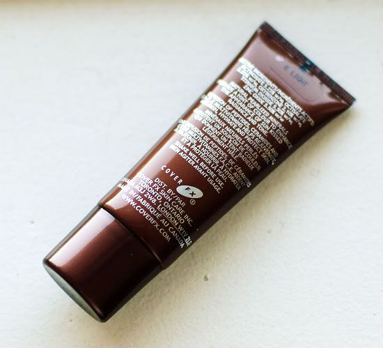
However, I decided to bite the bullet and buy this not so pretty tube of product at the local drugstore recently.

A little background on CoverFX. It's a Canadian-based company and the brain child of "corrective makeup specialist" Lee Graff who worked at Sunnybrook Hospital and Women's Health Scient Centre, chemical engineer Jenny Frankel, and dermatologist Dr. Neil Shear. All of its products are cruelty-free and they have been changing their packaging to become more environmentally friendly by the use of reduced/biodegradable packaging sourced from sustainable foresting. As well, they make both international and local charitable donations.

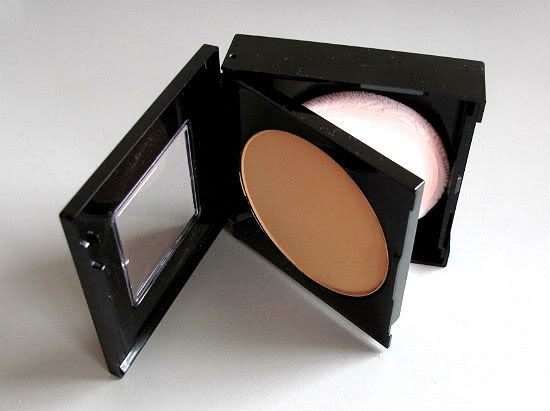
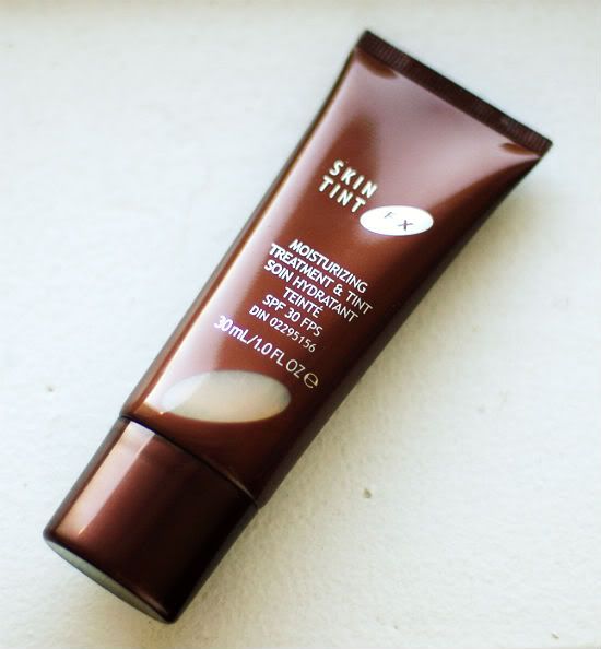
According to CoverFX's website, the "Moisturizing Treatment & Tinted Moisturizer with SPF 30" is a "rejuventing liquid mineral treatment" that provides tinted sun kissed looking skin. It is appropriate for all skin times including problem skin that is "dry, sallow, sun damaged". It is oil-free, fragrance free, and paraben free.

I reviewed the Bobbi Brown Tinted Moisturizer previously, which comes in a similar packaging (
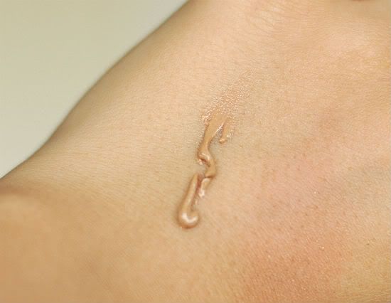
read review here.) although the BB one is 50ml vs 30ml for the Skin TintFX. The Bobbi Brown is more liquid and pigmented - what I consider a true tinted moisturizer. The CoverFX Skin Tint FX is more like a 2-in-1 tinted primer and sun screen, in my opinion.


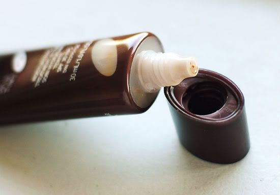
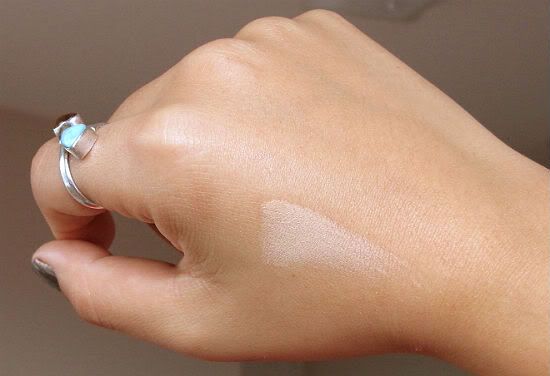
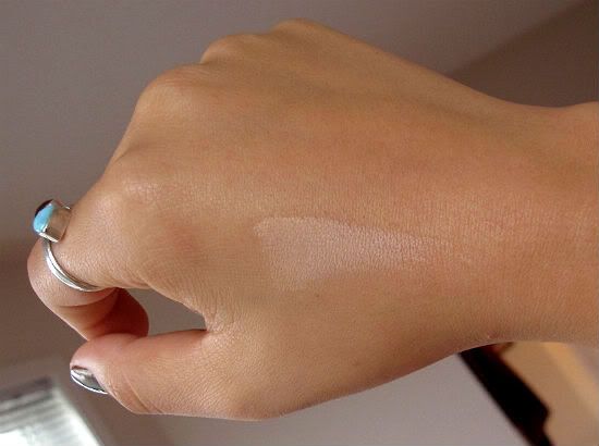
This product goes on like a light lotion but has a powdery finish - similar to the Benefit POREfessional primer (read review here) but a little thicker.

I have to say, I really like this product. It's the lazy-woman's way to cover her bases (oh so pun-ny!). It's a primer, color corrector, and sunscreen all in one. You can wear this alone on a hot summer day or in the winter, use as a base under a light layer of foundation.

I wouldn't use it in lieu of a moisturizer, however. Unless you have really oily skin. Personally, I still apply a light layer of gel moisturizer first (I use Clinique Derma White Brightening Moisture Gel Cream), let it seep into my skin, then apply this.

One thing to be careful of is the beading effect. Like a lot of cream-to-powder formulas, this one will bead if you rub too hard back and forth. Not sure why you would....but just in case.


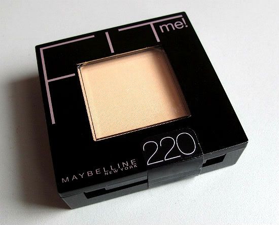
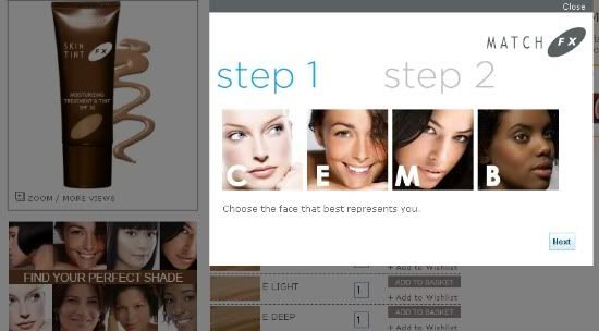
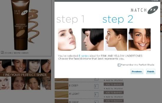
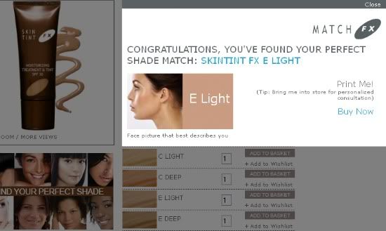
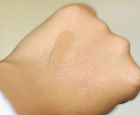
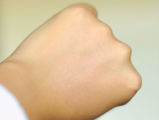
I am NC35-37 in MAC, Golden Beige in Revlon, and Natural Beige in L'Oreal. E Light might sound too light for me but it's actually perfect as there's only the option of Light or Dark and my summer tan is starting to fade. The M Light probably would have worked, too but I don't have a swatch of that.


The CoverFX SkinTint FX Treatment and Tinted Moisturizer SPF 30 is available at The Bay, Shoppers's Drug Mart, and Sephora. The 30ml/1oz tube retails for $39CDN/$42US

**This is one of the only times I've seen a product cheaper in Canada, even for Canadian-based brands!**

Wednesday, October 12, 2011

Just Reach for the Stars


all images via www.nationalgeographic.com

These would be really cool blown up huge and hung above a living room wall in a contemporary home with sleek lines and a minimalist esthetic.


via Google image search

Or perhaps printed on textile à la Christopher Kane...


via Fashion Clipping on flickr

Tuesday, October 11, 2011

The IKEA Family

I know a lot of people have a hate-on for IKEA but I've not over the "college" phase just yet. While I appreciate custom furniture and understand the difference in quality between composite and oak, there's a certain place in my heart for IKEA (don't even get me started on the delish Swedish meatballs!).

We're on a tight budget and IKEA offers the right mix of style, price, and quality. No, it does not raise the bar in any one category, but at the same time, it's easy enough to pass off as something a lot nicer with just a few personalized touches.

The beauty of IKEA, too is in the number of online resources from IKEA devotees and DIY addicts alike. There's plenty of photos and write ups on "IKEA Hacks" - pieces from the beloved (and often quirky) Swedish company that has been changed to added to, to create something else - bookcases made into benches, floating shelves made into desks, table tops made into paintings, etc.

My favourite resource is the popular IKEA HACKERS Blog. It's been around since 2006 and now has hundreds of really cool hacks featured. If you've ever read the DIY showcase blog Better After and want to see it done IKEA-style? Try the blog above.

To my delight, I discovered another resource site this morning. This one is actually hosted by IKEA itself. IKEA FAMILY LIVE is part blog, part image gallery. The About page explains the website concept as "the place to come for tips, ideas and inspiration for your home. At live you can share your passion for everyday life at home with others from around the globe."

The "Rooms" link is particularly helpful as you can search inspirational photos by the type of room - living room, hallway, workspace, etc. But what I love most is how people have incorporated IKEA pieces into different styles and rooms. There's no limit to what you can do!


all images courtesy of www.ikeafamilylive.com

LinkWithin

Related Posts Plugin for WordPress, Blogger...