Thursday, April 25, 2013

REVIEW: Maybelline Color Tattoo 24hr Eyeshadow in 23 Bad to the Bronze

I finally picked up one of these much talked about Maybelline Color Tattoo 24hr Eyeshadows. I went the totally boring route and picked a safe aka neutral colour - Bad to the Bronze.

It's been a long time since I've used a cream eyeshadow. I think my last one was one of those Revlon eyeshadow quads that came with a row of 4 round pans. Anyone remember those?

Anyway, while I liked the ease of application on those, they had horrible staying power. So since then I've stuck with pressed powder eyeshadows. I decided to give it another go after hearing all the hype surrounding these long lasting cream eyeshadows. Maybelline has Color Tattoo, Make Up Forever Aqua Creams, MAC Paint Pots, Stila Smudge Pots, Benefit Creaseless Cream Shadow/Liners, and well, you get the idea...

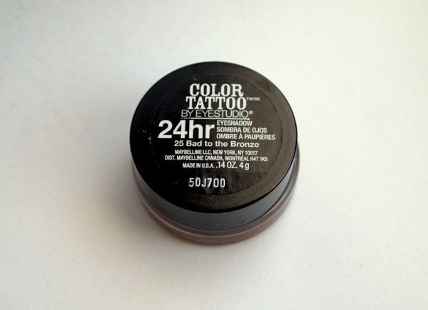
Although Maybelline is a drugstore line, it's been receiving great reviews on Makeupalley and various blogs. It's also been compared to its higher end counterparts, particularly MAC's Paint Pots, so I thought I'd start with it.

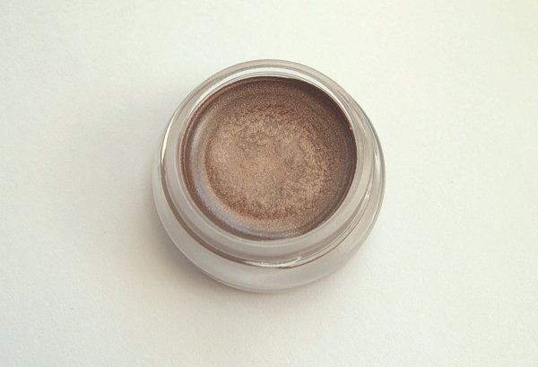
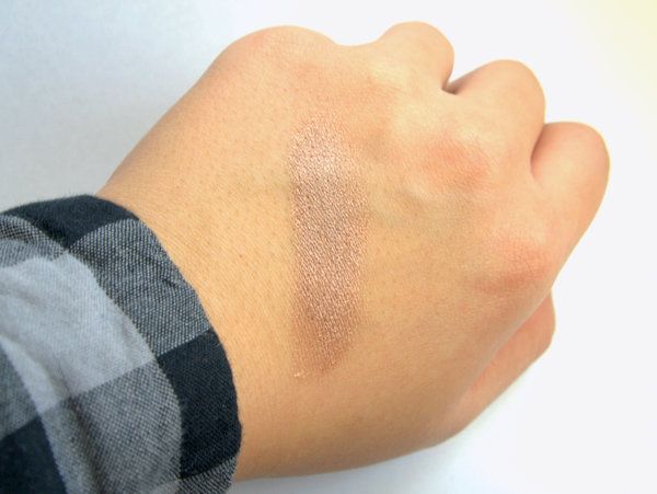
Bad to the Bronze is a metallic medium tan color. When I think Bronze, I think of something a little more golden. Temptalia has a swatch on her website where it seems very gold and shimmery, but I didn't find that to be the case. Reviewing my own swatch photo and those of other bloggers, it seems most see it as being more in the tan or taupe family. Also, while it is metallic, it's certainly nowhere near a chrome finish. The metallic is more of a satin with subtle shimmer. I would still categorize this in the "safe" - versatile, wear to work, everyday type of color.

I'm hesitant to make a blanket statement about the Color Tattoo in general as I've read reviews that the pigmentation/application is different depending on the shade. However, I can say that Bad to the Bronze in particular, has staying power. I was using Stila's Primer Pot in Taffy but this is just as good and unlike the primer pots, these can be used alone as eyeshadow. I would say this particular shade is similar to Stila's Smudge Pots in that they are long-lasting cream eyeshadows but the texture is closer to the Primer Pots - thicker, more opaque, budge proof.

I can also attest to its claim of lasting 24 hours. Yes, I applied it before work (around 9AM), went out after work, then prompty fell asleep when I got home until about 9AM the next day. I had what my husband calls "panda eyes" when I woke up, but my lids were still Bad to the Bronze'd up!

I'm currently using this eyeshadow as a base under Revlon's Luxurious Color eyeshadow single in Polished Bronze. The two colors are very similar (Polished Bronze is less metallic) but the Revlon has horrible staying power. Previously I used Stila's Primer Pot as the based but using a like-colored base means even longer staying power - as the powder shadow wears off, the color remains.

I am definitely purchasing more cream eyeshadows. I might pick up a couple more neutral shades from the Color Tattoo line. The rest of the colors are beautiful but not wearable for the office. I'm also going to venture out and try a few more, perhaps from MUFE, MAC, and Benefit.

Do you use cream eyeshadows? Any recommendations?

Wednesday, April 17, 2013

Kitchen Progress - Paint & Photoshop

A little more progress has been made on the kitchen with a touch of paint and a dash of photoshop.

I painted most of the left and back walls in Martha Stewart's Aegean Blue. Let's not kid ourselves...it's baby blue. The kind you use in nurseries. But it's what I had on hand on a Sunday afternoon after all the stores had closed. The Martha Stewart sample paint pots went on sale for $1 (usually $5-6, I believe) at Home Depot last year and I went crazy, buying multiples of each color. I've already used 5 in the powder room (Araucana Teal) and just knew I could find a use for the others! I still have a few colors left which you might see in future projects...

I decided I can live with a baby blue wall once I added a little more elbow grease into the mix. I didn't want this color to overpower the small nook, so I left the bottom 40 inches white (same height as the kitchen countertop) in preparation for moulding. This will continue from the end of the kitchen counter to the corner of the back and right walls.

On the left side I did a little photoshopping. The black represents the magnetic chalkboard wall. The space was starting to look a little too dramatic and elegant for its small size so this "fun" wall will add a little contrast and lighten the mood. Plus, it'll be nice to have a wall sized notepad to practice my chalkboard skills, write a few pick-me-ups, and plan out our week.

FYI, the curtains are Target, the double curtain rods and blue paint are Martha Stewart. The kitchen table is Ikea. The chairs are Kitchen Stuff Plus. The chandelier is Rona. The magnetic paint and chalkboard paint (to be purchased) are by Rustoleum.

Sunday, April 14, 2013

Kitchen Progress - The Other Side

I have a cold. And it sucks because I'm at the stage where drugs (in this case Tylenol Cold & Sinus Extra Strength) keep the symptoms muzzled. Unfortunately, coughs do not seem to be part of the deal. While out buying a laser level, which by the way is the absolutely best invention ever, I coughed so uncontrollably I had to run to an un-populated dark corner of the store to hack my lungs out!

Anyway, the point is....despite my illness, I couldn't sit still this weekend and had to start working on the "other side" of the kitchen aka our breakfast nook aka our dinette aka where guests have to squeeze in like sardines because we don't actually have a dining room.

Here's a sneak peak of what's happened so far. 1) Hanging the curtains and curtain rods 2) Making a huge mess on the dining table.

Before hanging the curtains, I had painted half the walls from a cream to a white. But afterwards, it just felt too bare and stark for the drama of flowy turquoise fabric. I found a few sample bottles of paint in the same color and should have just enough for most of the left and back wall. Instead of the whole wall, I'm painting about two-thirds the way down. The rest I will keep white and eventually install a chair rail in between.

Stay tuned!

Thursday, March 14, 2013

Kitchen Progress - A Somewhat Final Reveal (For Now)

At the end of January, I posted that I was working on our kitchen and gave a sneak peak. Well, there's still plenty of to-do's let to do, but I'm too impatient to wait until I'm 100% done to show you how it looks. And really, as a DIY and home improvement enthusiast, is any space every completely DONE?

Here's what the kitchen looked like last fall. Oak cabinets and builder grade beige paint. Bland is the name of the game here.

And here's what it looks like today!

What was done:
-A pair of chandeliers for the kitchen and breakfast area
-White subway tile backsplash with gray grout
-Painted kitchen cabinets in Rustoleum's Winter Fog
-Stainless steel cup pulls on the drawers

And that's it! All done for under $300 and that's including buying a couple tools and renting a wet tile saw. I'll admit, it did involve using a couple gift certificates received for Christmas and buying a couple things across the border where some things are significantly cheaper.

What's still to be done:
-Seal the grout with grout sealer
-Install over-the-range microwave or if I can't find one small enough, run the subway tiles up to the rangehood
-Roman blind for the window over the sink
-Accent rug

Once those things are done, I'd like to paint the walls a bright white before moving on to the other side of the room, which is the breakfast area. I'll post more about my plans for that very compact space soon.

Monday, March 4, 2013

ZARA Online Shopping Coming March 6 to Canada!

Saw this on Zara Canada's website today....

Can I get an O.M.G? Anyone? ANYONE?

I am so excited for this to happen! There are not enough Zara store around me and stock is so luck of the draw at each location that this is going to be a godsend. Plus, Target is opening in a few locations near me. Things are definitely lookin' bright on the shopping end this year (but perhaps a little dark for my wallet.)

LinkWithin

Related Posts Plugin for WordPress, Blogger...