Showing posts with label decor. Show all posts

Wednesday, April 17, 2013

Kitchen Progress - Paint & Photoshop

A little more progress has been made on the kitchen with a touch of paint and a dash of photoshop.

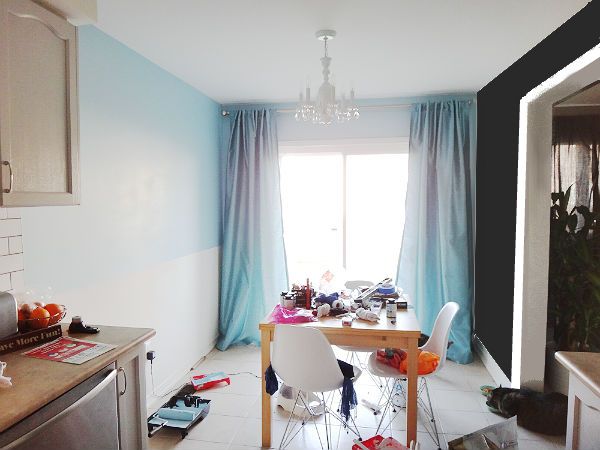
I painted most of the left and back walls in Martha Stewart's Aegean Blue. Let's not kid ourselves...it's baby blue. The kind you use in nurseries. But it's what I had on hand on a Sunday afternoon after all the stores had closed. The Martha Stewart sample paint pots went on sale for $1 (usually $5-6, I believe) at Home Depot last year and I went crazy, buying multiples of each color. I've already used 5 in the powder room (Araucana Teal) and just knew I could find a use for the others! I still have a few colors left which you might see in future projects...

I decided I can live with a baby blue wall once I added a little more elbow grease into the mix. I didn't want this color to overpower the small nook, so I left the bottom 40 inches white (same height as the kitchen countertop) in preparation for moulding. This will continue from the end of the kitchen counter to the corner of the back and right walls.

On the left side I did a little photoshopping. The black represents the magnetic chalkboard wall. The space was starting to look a little too dramatic and elegant for its small size so this "fun" wall will add a little contrast and lighten the mood. Plus, it'll be nice to have a wall sized notepad to practice my chalkboard skills, write a few pick-me-ups, and plan out our week.

FYI, the curtains are Target, the double curtain rods and blue paint are Martha Stewart. The kitchen table is Ikea. The chairs are Kitchen Stuff Plus. The chandelier is Rona. The magnetic paint and chalkboard paint (to be purchased) are by Rustoleum.

Sunday, April 14, 2013

Kitchen Progress - The Other Side

I have a cold. And it sucks because I'm at the stage where drugs (in this case Tylenol Cold & Sinus Extra Strength) keep the symptoms muzzled. Unfortunately, coughs do not seem to be part of the deal. While out buying a laser level, which by the way is the absolutely best invention ever, I coughed so uncontrollably I had to run to an un-populated dark corner of the store to hack my lungs out!

Anyway, the point is....despite my illness, I couldn't sit still this weekend and had to start working on the "other side" of the kitchen aka our breakfast nook aka our dinette aka where guests have to squeeze in like sardines because we don't actually have a dining room.
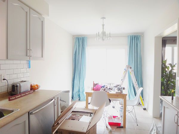
Here's a sneak peak of what's happened so far. 1) Hanging the curtains and curtain rods 2) Making a huge mess on the dining table.

Before hanging the curtains, I had painted half the walls from a cream to a white. But afterwards, it just felt too bare and stark for the drama of flowy turquoise fabric. I found a few sample bottles of paint in the same color and should have just enough for most of the left and back wall. Instead of the whole wall, I'm painting about two-thirds the way down. The rest I will keep white and eventually install a chair rail in between.

Stay tuned!

Thursday, March 14, 2013

Kitchen Progress - A Somewhat Final Reveal (For Now)

At the end of January, I posted that I was working on our kitchen and gave a sneak peak. Well, there's still plenty of to-do's let to do, but I'm too impatient to wait until I'm 100% done to show you how it looks. And really, as a DIY and home improvement enthusiast, is any space every completely DONE?

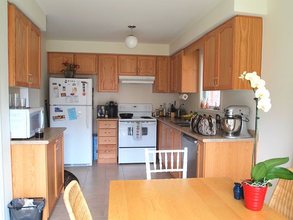
Here's what the kitchen looked like last fall. Oak cabinets and builder grade beige paint. Bland is the name of the game here.

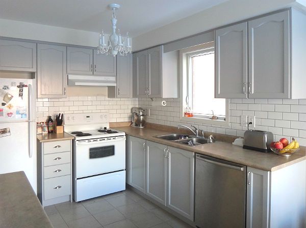
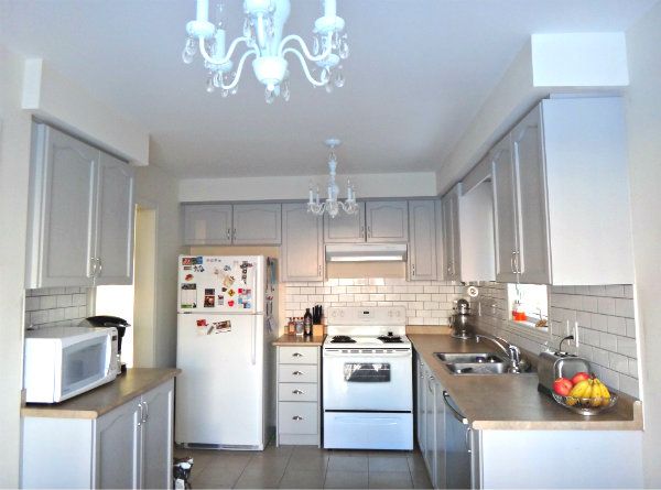
And here's what it looks like today!

What was done:
-A pair of chandeliers for the kitchen and breakfast area
-White subway tile backsplash with gray grout
-Painted kitchen cabinets in Rustoleum's Winter Fog
-Stainless steel cup pulls on the drawers

And that's it! All done for under $300 and that's including buying a couple tools and renting a wet tile saw. I'll admit, it did involve using a couple gift certificates received for Christmas and buying a couple things across the border where some things are significantly cheaper.

What's still to be done:
-Seal the grout with grout sealer
-Install over-the-range microwave or if I can't find one small enough, run the subway tiles up to the rangehood
-Roman blind for the window over the sink
-Accent rug

Once those things are done, I'd like to paint the walls a bright white before moving on to the other side of the room, which is the breakfast area. I'll post more about my plans for that very compact space soon.

Tuesday, October 30, 2012

The Thinking Room

The master bedroom is at a halt right now. It's painted and the curtains and ceiling light have been installed. But before decorations go in, we need new furniture. We currently have a queen sized IKEA Malm bed, 6-drawer Malm dresser, and 2 $10 Lack tables as our nightstands. Both were victims of our DIY move - chipped and scratched laminate, broken and crooked drawer fronts, etc. The MDF-and-laminate dresser also just isn't a match for the explosion of clothes straining to burst out (too much Winners trolling...).

To give you an idea of how dire the situation has become...I have to iron each piece of clothing pulled from that abyss several times on high heat because it is THAT wrinkled from smooshing!

The tentative idea is to install the IKEA Pax wardrobe system on one side of the room and purchase better quality (solid wood) bed and dresser.

What this means is...don't expect "Afters" from the master bedroom anytime soon. I'm instead going to focus a bit of money on finishing the powder room downstairs (will post about that soon!) and starting the office upstairs.

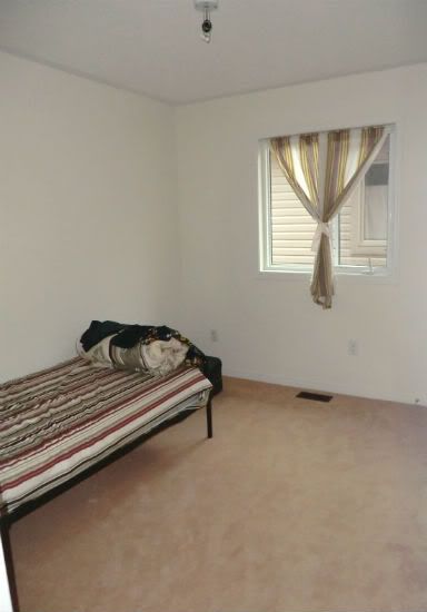
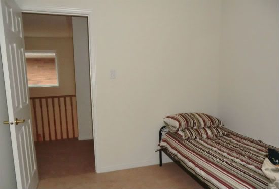
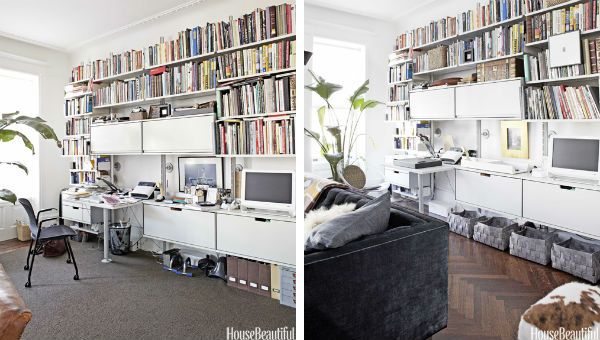
This is the space I will be working with. Uninspiring much?

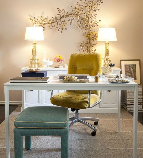
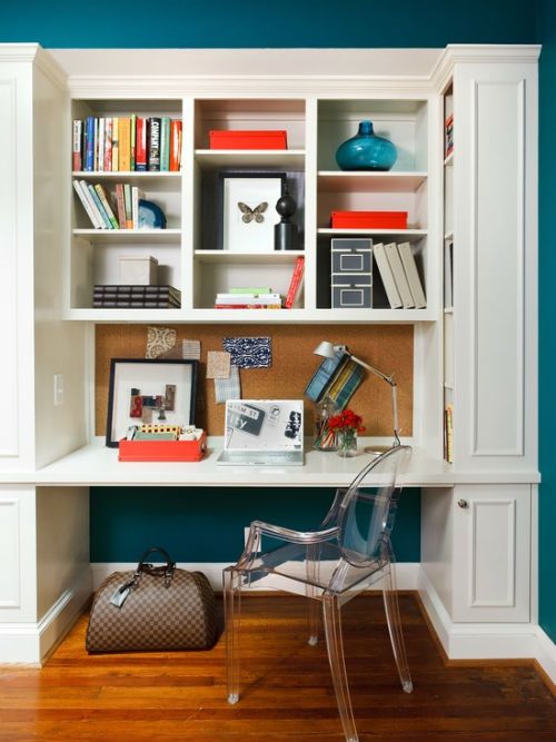
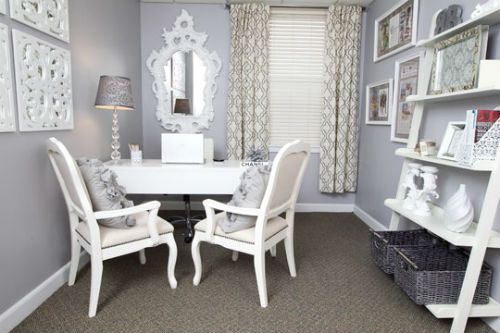
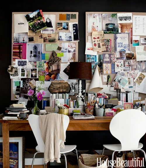
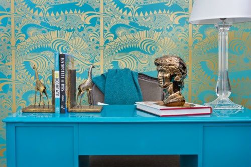
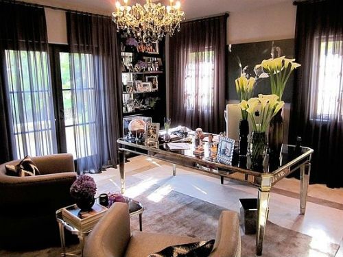
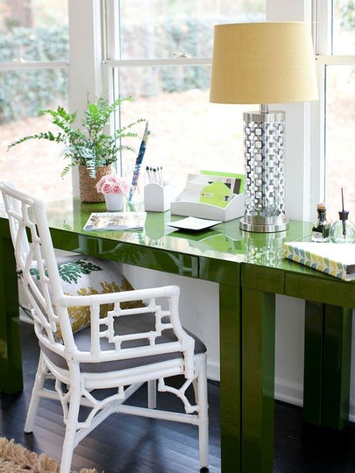
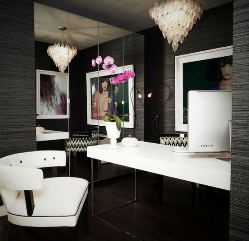
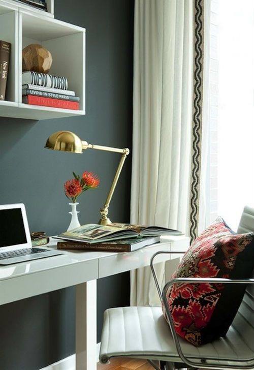
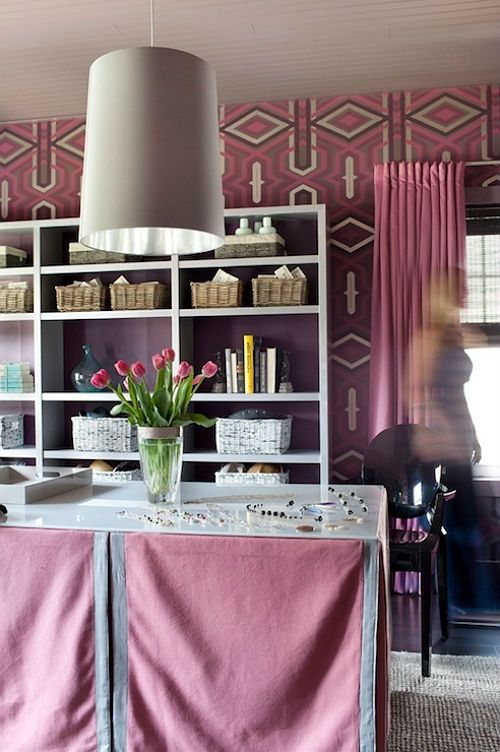
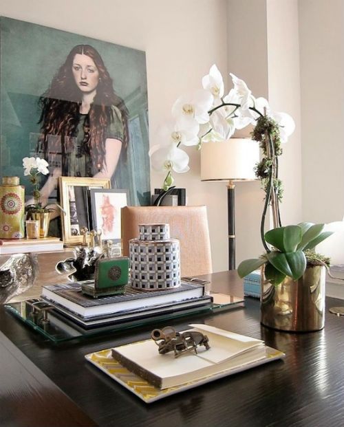
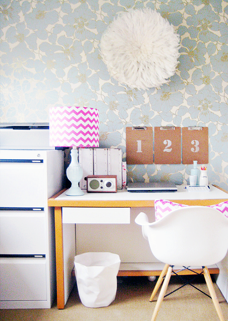
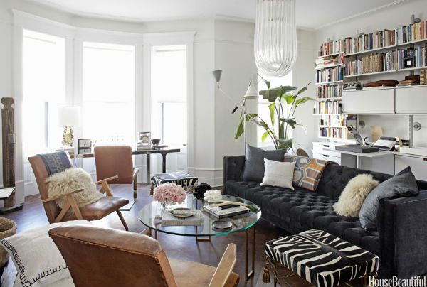
Here are some home office spaces that have caught my eye..

The inspirational photos I have gathered come from completely different spectrums of design but there is something that draws me to each.

I think looking through these, I'm definitely not a minimalist. While I do love the use of white, black, crisp straight lines...I'm always looking for drama as well. I think these days, I'm drawn to rooms that are 1 part classic, 1 part modern, with a dash of glam.

There are also two key requirements for our office space:

1) Functionality
We have a boxy all-in-one printer, computer, router, modem, and a bunch of other unfun but neccessary office equipment. Office spaces in magazines are always so pretty and clear but once thing that's glaringly obviously in many is the lack of actual office equipment! Case in point above. This I think will be a big challenge to make sure that we have a functional office that is still esthetically pleasing.

1) Convertabilty into a nursery.
We expect to have a child in a couple years. If this happens, this room will need to be converted into a nursery (hopefully we'll have a basement finished by then!) with minimal work on our end. This means we have to consider paint color, permanent fixtures to the walls, etc.

Good thing is...I'm really looking forwards to this design challenge!

All photos via my Pinterest "Beautiful Interiors" board located here.

Sunday, October 7, 2012

Living Room Progress - Part IV

It's been exactly 5 months since my last progress report on the living room and I'm ready to show you what we've done since. It's not much because we've been working on a few other areas of the house as well plus, life gets in the way sometimes. You know?

Here was my to-do list back after the last update:

Short Term: Art above bar, feature above sofa, planter for free
Long Term: Bigger TV, hardwood floors, built-in entertainment unit / bookcases

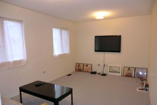
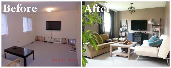
To recap, this is how the room looked before we moved in:

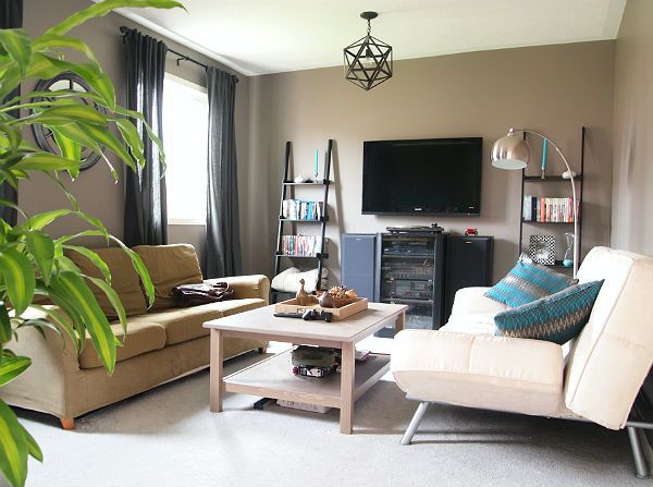
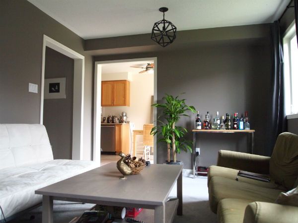
This is how it looks today:

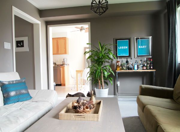
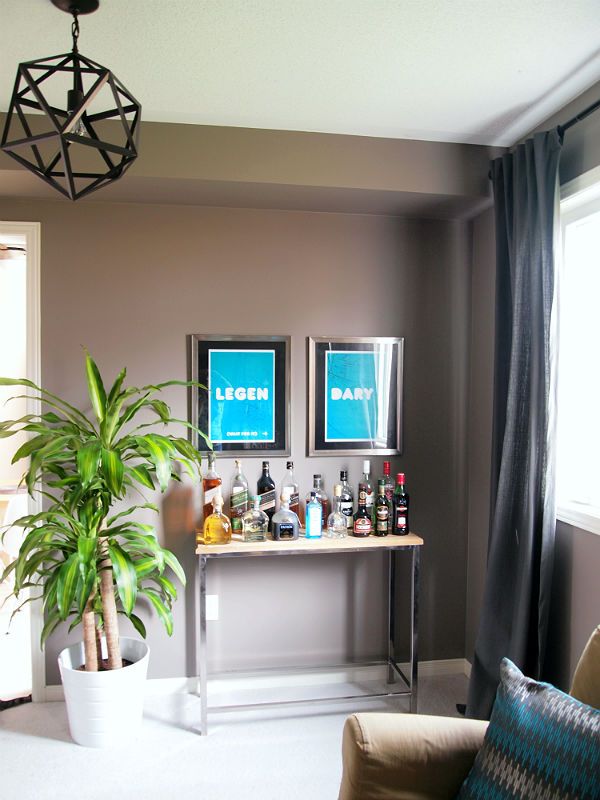
Art above the bar and planter for the tree can be crossed off the short term list but I still haven't found a feature for above the white sofa. I had planned to try the large mirror we currently have standing in the kitchen but am too lazy to tackle the whole let's-try-hanging-a-gazillion-pounds-on-the-wall project. My other plan to paint a giant canvas has not come to fruition either. Again, that laziness. It got to me.

But...I can also now cross 1.5 items off the long term list which in my opinion trumps my one fail on the short term. You may notice that our TV has grown a bit. It's now a 42 1080P LCD up from a 32 720P LCD. And since we got an amazing deal on it, I don't feel so guilty for skipping ahead on the plans.

Same goes for the bookcases. I eventually want built-in bookcases for this wall but that can't happen until we install hardwood and that can't happen until we magically pull some cash out of....nowhere. So for the time being, I found these for a steal ($30 each!).

Just for fun and because it never gets old (at least for the person trying to show off) here's another photo of the room so far in a Before/After comparison:

I probably won't be working on this room for a while and turning my attention towards the master bedroom and sorely neglected kitchen and office room. But never fear, I do have some plans for this space once I'm back at it:

Short Term:feature above white sofa, pillows for brown sofa
Long Term: new matching sofas, built-in bookcases and perhaps fireplace?, crown moulding, hardwood floors

As you can see, I dreamed big with the long term plans because well, since it's going to really long term, I might as well dream big!

Previous living room posts: Potential Layout | Progress Report: Part I | Progress Report: Part II |

Tuesday, September 18, 2012

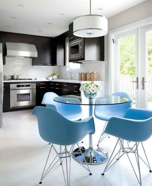
The Eames Eiffel Chair

I'm not generally a fan of mid-century design - I find a lot of items either too cutesy, too contrived, or just too plain old fashioned.

I like pieces that don't scream "I'm from (insert year)!"...or "I'm (insert specific style)!". The frugalista side of me is drawn to pieces that feel home just as well in a bohemian living room as it does in a farmhouse style kitchen.

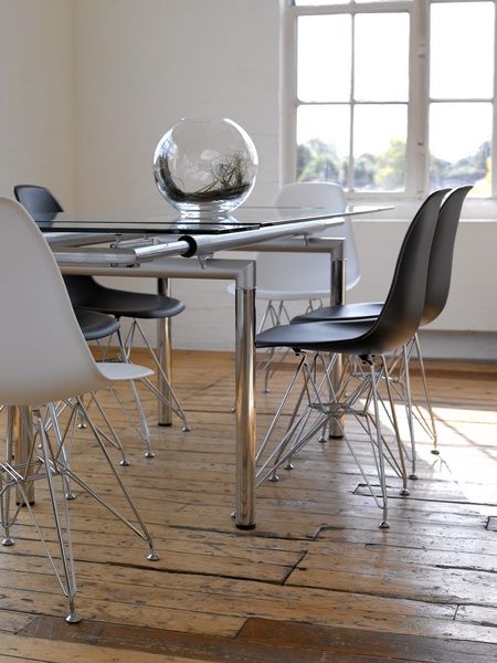
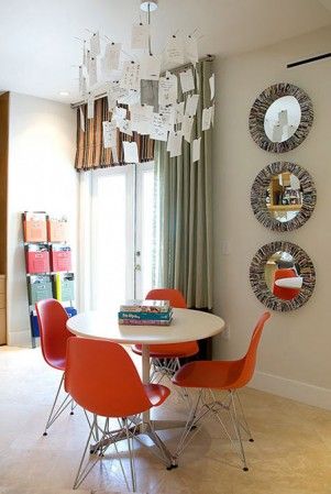
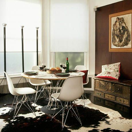
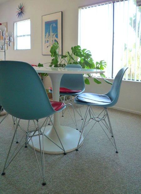
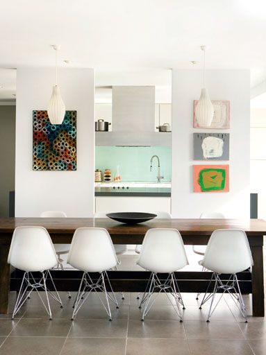
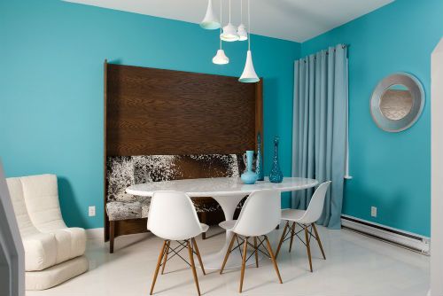
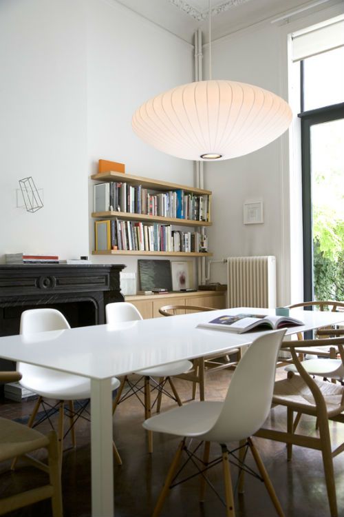
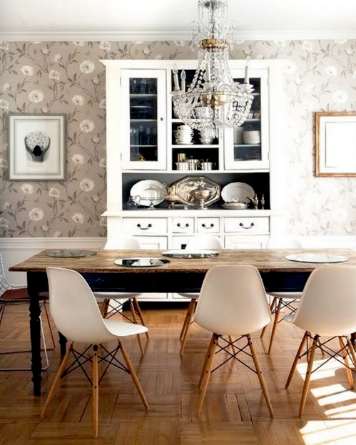
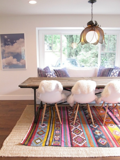
I guess that's why I love the Eames Eiffel chair. It's one of those pieces that by itself is so industrial, so plastic and chrome and nothing else but it's a chameleon, really.

Although originally created back in 1950 by wonder-couple Ray and Charles Eames, its popularity and relevance has not faded with time.

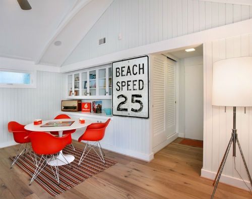
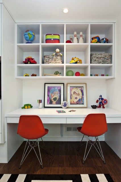
Just take a look at all it can do.....

via
http://www.lolalina.com


via
http://www.designclassics.co.uk


via
http://honeyliving.blogspot.com


www.vertigo-interiors.co.uk

via www.modernfindings.com


via blog.insideoutcolouranddesign.com.au


via www.colinandjustin.tv

via www.lolalina.com


via http://www.nuevo-estilo.es


via http://www.decorpad.com


via http://www.decorpad.com


via http://www.decorpad.com


via http://www.decorpad.com


via http://www.decorpad.com
 
There's a particular reason I'm posting these chairs....

I received a very well timed email from Kitchen Stuff Plus. Unfortunately, we cannot afford ourselves a set of Eames originals (heck, we wouldn't even be able to justify one!) but we definitely can afford a set from KSP so...

We're getting them! Soon! Like....hopefully in the next couple days!!!

Friday, July 27, 2012

Kitchen Nook Inspiration

I've been severely neglecting this blog. I have so much to post about but have just been feeling this general lack of energy in between work, running errands, puttering around the house, and dealing with the heat wave in the past couple weeks with NO AIR CONDITIONING!

I have however, been keeping up with my favourite blogs and today I came across this photo on Young House Love's blog (originally from House Beautiful).


via

I am in love! 1) I have that mirror (or at least, a cheaper version of it) and have yet to find a place for it. 2) The accent "wall" looks to be panelling which is a great idea as I'm not sure about doing such a dark color permanently. 2) The panel color is similar to our old living room accent wall, which I adored.

It's funny. Seems like I have a real weakness for this type of palette. Here's the photo that inspired our living room years ago (see Home Tour section of my blog):


via

Similar, no?

Now I'm really tempted to make a weekend project out of doing something similar in our kitchen nook.

Monday, June 4, 2012

Guest Bathroom Update & Storage Solution

I've been busy with the guest bathroom and can't wait to reveal it. All the painting is now done but I have a number of little tweaks - lighting, storage, decor - to finish up before I post the pics.

This is a "working" bathroom in that I use it to store all my toiletries/cosmetics and use it to get ready in the mornings. So the challenge is in finding some way to make the space look hotel-like while still allowing me easy access to the products I use daily. 99% of the time, this bathroom is used by me so I don't want to have to move out everytime a guest comes to visit.

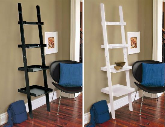
I got an email from Kitchen Stuff Plus today and one of this week's deals is a ladder shelving unit that comes in black or white. Here's the online product photo:


via kitchenstuffplus.com

I had considered building shelves into one corner of the bathroom but I much prefer this idea. It's not permanent and the ladder does not visually shrink the space like a closed cabinet or built in shelves would.

My only concern with the above is the styling - the photos seem to imply a more industrial look with the metal screws. But it might be an easy fix with black or white spray paint. I'm going to check it out this week.

You may or may not see this piece in the final reveal!

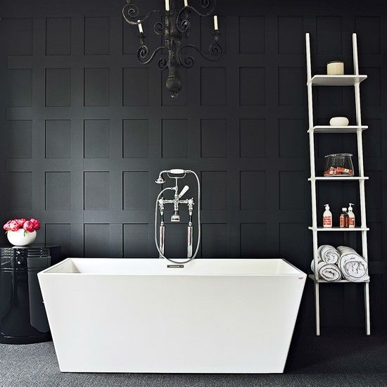
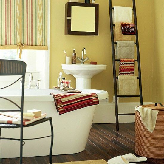
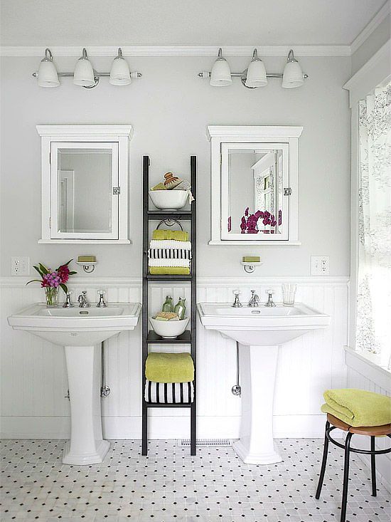
Before I purchased the piece, I also wanted to get an idea how it would look. So I found a few inspiration photos online:


via housetohome.com


via decorpad.com


via housetohome.com

Monday, May 7, 2012

Living Room Progress - Part III

This is part three of the progress report and I suspect it will be a work-in-progress for a while yet so expect progress reports like a never-ending Hollywood franchise. This is post-cleanup because we were having guests over. It's still not magazine-perfect but whatever! It's much better than the before (which no one needs to see).

As a refresher, here's the BEFORE of our living room taken before the previous owner moved out.


Looks just sooo cozy, right? This is what it looks like now...

From the hallway


From the kitchen


From the living room looking out


This is with full sunshine outside. As soon as it's a little overcast, the room becomes quite dark. But I decided to embrace the lack of light and create a cozier place rather than go all white. I find it's difficult to get that picturesque all-white look without help from natural and studio lights anyway.

There's a few short term improvements I'd like to make:

-Art above the bar
-A feature above the sofa (we have a giant mirror that may work)
-A planter for the tree

Long term wishlist (in order)?

-Bigger TV
-Hardwood floors
-Built-in entertainment unit / bookcases

Previous living room posts: Potential Layout | Progress Report: Part I | Progress Report: Part II |

Monday, April 30, 2012

TALENT: Jumping on the Nate Berkus Bandwagon

I've been hearing the name "Nate Berkus" dropped here, there, and everywhere for the past while. But without cable and a lack of patience for Youtube, I haven't really seen his work to judge for myself. I just know that he's loved on the blogosphere and is very pro-DIY on his show.

As with anything popular where I didn't jump on the initial bandwagon, I'm always hesitant to try it out. Harry Potter, Trueblood, chevron stripes, and the current Izayaka craze in Toronto come to mind. If I get into it now, will I be able to make an objective decision or is it just repetitive exposure to the craze that's influencing me? Is it really all that awesome or 50% hype?

That's why it was quite a pleasant surprise to come across a beautiful One-Day Makeover feature in this month's House Beautiful and only connect the Nate Berkus in this feature to THE Nate Berkus. Not sure why it didn't click instantly but I'm glad for the temporary brain freeze. Because I came to the (objective) conclusion that yeah, that guy is pretty good!

BEFORE & AFTER


THE FINAL PRODUCT


This certainly isn't a dramatic makeover. No dilapitated house turned model home here. But this has to be one of my favourite makeovers for how useful it is to the everyday home dweller on a budget.

Sure there are beautiful spaces featured in every magazine, but I find it hard to recreate many of them because they are just so dramatic or call for too many changes to furniture or structure.

This article shows you how minor furniture changes, use of accessories and thoughtful arrangement can really complete a room. Upon seeing the room for the first time, this was what Nate had to say:

•Eclectic is fine, and I love certain pieces, like those leather chairs. But if you want people to gather here, the room needs to be more comfortable.

•Let's get a sofa to anchor the seating area and give you another reason to come in.

•Bare walls make the room feel cold. I'm going to get something to go over the fireplace.

•It's missing that last layer of detail that adds texture and warmth, like throw pillows. Everything seems to stand alone. We're going to pull it together."

And folks, this is why he's the professional and I'm not. I find it easy to work big. To create the general layout of a room, come up with a color palette, etc. but it's hard to "complete" the space. There's always that something-something that's missing but I can't put a finger to it. Every comment he had about the house above made me go, "Ahh, so that's what it was". In short, I can tell something's missing but he can tell what that is.

Check out the article on House Beautiful's website for additional photos from the day and Nate's thought process in putting this room together. CLICK HERE!.

Are you a fan of Nate Berkus? Has he done other work that you particularly like? Please share them! I'd love to see.

LinkWithin

Related Posts Plugin for WordPress, Blogger...