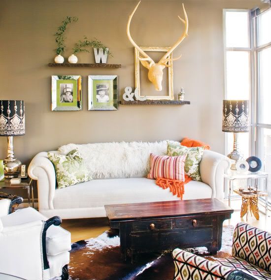
I've read over and over again that not-so-secret designer trick of keeping wall and decor colors similar to create flow between rooms and thus creating a more spacious feel. Wayne & Chad have gone the complete opposite but in my opinion, achieved the same result with a lot more fun.
While I'm a little less adventurous (hello, fan of the monochromatic monolithic Restoration Hardware fall catalog here!) than these two, I do appreciate how much fun their space is. It's obviously personal and really, at the end of the day, isn't that what we should be striving for in our own homes?
photos courtesy of Style at Home
Original article at StyleatHome.com.


No comments:
Post a Comment